Brand & Design System
The Styleguide
The visual language of The Anatolian Drive — an editorial system built on navy, gold and terracotta, set in Cormorant Garamond and Jost. Every token below is pulled from the live design system so this guide and the website never drift apart.
01 · Identity
Logo & emblem
The emblem is the heart of the identity. Give it room to breathe — keep a clear-space of at least its own padding on every side, never crop, recolour or stretch it, and place it on navy or photography rather than busy light backgrounds.
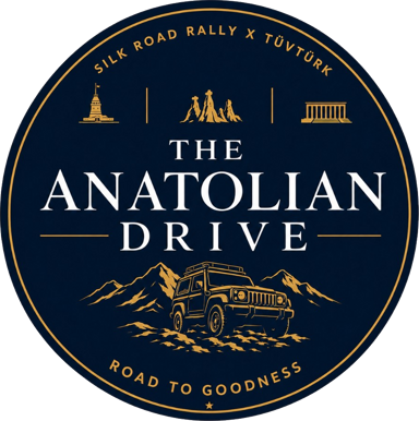
Primary emblem · clear-space
Wordmark
Set in Cormorant Garamond, all-caps, with generous letter-spacing. “DRIVE” always carries the gold accent.
Partner & organiser logos

Real partner assets only — never placeholders. The TÜV Türk mark sits in the header and footer as co-organiser; the Silk Road Rally lockup signals shared heritage.
02 · Colour
Palette
A deep-navy canvas, lit by gold and warmed by terracotta. Navy carries almost every surface; gold is the single accent for emphasis; terracotta marks dates and route moments; parchment is reserved for rare light surfaces.
Navy
The primary canvas — almost every surface and the page background.
Navy Deep
Footer, deep panels and the base beneath graded photography.
Gold
The single accent — emphasis in headings, CTAs, links and labels.
Gold Light
Subtle accent fills and gentle hover washes over navy.
Gold Mid
Secondary accent for subtitles and large decorative type only.
Terracotta
Dates, the route finale, error states and the credit heart.
Parchment
Reserved for the rare light surface — used sparingly.
White
Primary text colour and the strongest highlights on navy.
Muted
Secondary text and quiet navigation links.
Faint
Hairlines and the faintest separators on dark surfaces.
Border
The gold-tinted hairline framing sections, cards and grids.
Contrast & legibility
Gold and accent text must always keep sufficient contrast on navy. Use solid gold for anything readable; never let accent type fade into a dim, low-opacity tone for body copy or links.
Do — solid gold on navy
≈ 6:1 contrast — comfortable for headings, links and labels.
Avoid — dim gold for text
Low-opacity gold drops below the readable threshold. Reserve faint tones for hairlines and decorative fills only.
03 · Typography
Type scale
Two typefaces carry the whole system. Cormorant Garamond — a high-contrast serif — sets every display heading at light weights. Jost, a geometric sans, handles body copy, labels and UI at 300–400 weight with wide tracking on small caps.
Display · Cormorant Garamond
AaCormorant Garamond · 300 / 400
Body · Jost
AaJost · 200 / 300 / 400
04 · Components
UI patterns
The recurring building blocks of the site, rendered live with the real classes so they stay in sync. Buttons, the eyebrow-and-title pattern, rules, meta label/value pairs and links.
Buttons
Primary gold for the main call-to-action, the lighter gold button for the nav CTA, and an outlined secondary for alternatives.
Section header pattern
The journey
11 stages across Anatolia
Meta label / value
Start date
2 August 2026, Istanbul
Rules & dividers
05 · Layout & motion
Spacing, layout & motion
Content sits in a centred measure with a fluid gutter. Sections share a generous vertical rhythm, and content reveals gently on scroll — always disabled for visitors who prefer reduced motion.
Motion
.reveal
Reveal transitions use a soft ease (cubic-bezier 0.16, 1, 0.3, 1) over ~0.9s with a subtle upward shift. Honour prefers-reduced-motion everywhere.
06 · Imagery
Imagery & iconography
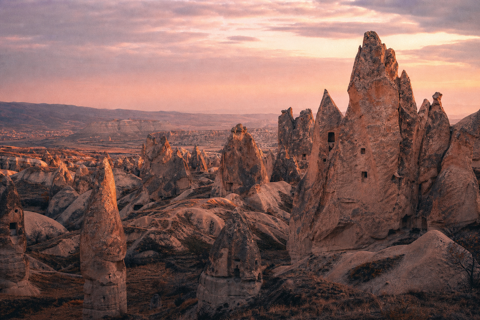
Two visual registers work together: cinematic, lightly desaturated stage photography graded toward navy shadows and warm highlights, and fine engraved gold-on-navy line illustrations for icons, the route map and decorative grids.
Photography grade
saturate(0.82) · contrast(1.06) · brightness(0.92), with a navy-shadow / warm-highlight overlay and a multiply blend.
Engraved iconography
Thin gold strokes on navy, geometric and engraved in feel — compass, amphora, tent and road motifs echo the rally's cartographic spirit.
